It’s 2015, is your website mobile/tablet friendly? Smart phones and tablets are becoming increasingly popular and are the preferred method for accessing the Internet. Your business now needs to think about building a mobile version of your website in order to provide customers a better experience. The risk of not having a mobile site can greatly outweigh the benefits.
Basically, if your site isn’t optimized for mobile, you are ultimately losing race registrations and customers. Research shows that 57% of mobile users will abandon your website if it takes a long time to load. Considering this fact, if you don’t already have a mobile website, you need one now!
Here are 3 reasons why you, as a race director, event organizer or timer, must have a mobile-optimized website:
1. Your normal site is NOT thumb-friendly
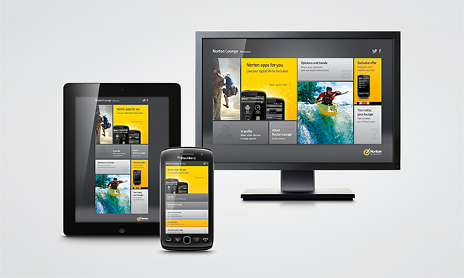
Your users aren’t always sitting in front of a desktop or laptop. Often times, they are on the go- accessing your website from a mobile device or tablet. How do you go about creating a mobile-friendly site? It’s not as easy as making your existing website fit on a mobile. The dimensions on a mobile device are significantly smaller than a computer screen and will distort your website. A mobile website should be a simplified version of your desktop website and should include easy navigation and text that can be read easily on a mobile phone. Many websites are moving to a “responsive website.” Responsive means that your website recognizes the device being used (laptop, desktop, tablet, smartphone) to view your site and will resize itself accordingly for optimal viewing.
2. Watch out! Google might penalize you.
Just recently, Google announced that they will be using mobile optimized sites as a ranking factor in their mobile search results.
“Starting April 21, we will be expanding our use of mobile-friendliness as a ranking signal. This change will affect mobile searches in all languages worldwide and will have a significant impact in our search results. Consequently, users will find it easier to get relevant, high quality search results that are optimized for their devices.”
You can already see “Mobile-friendly” displayed in Google’s search engine results. Here’s the search results for Chronotrack.
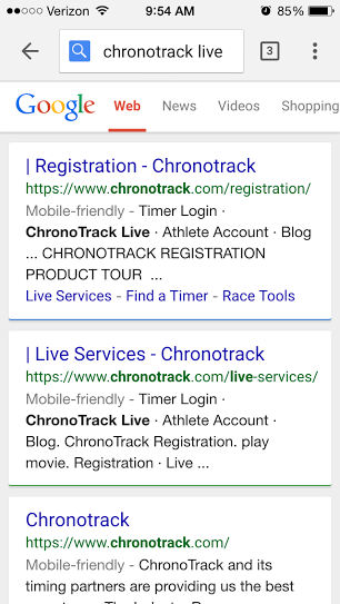
Essentially, if your website isn’t mobile friendly you will not see your results at the top of Google in a mobile search. You will be penalized. Google is looking to provide its users the best search results possible. They want to display the best content that a user can view on a mobile or tablet device. You should care how your customers (and potential leads) interact with your site. It may be something you don’t think about, but from a design standpoint, if your website looks like it’s from the early 2000’s its time for a change.
If you’re not sure if your site is mobile-friendly, Google makes it extremely easy to test whether it is or not. To see if your website passes, click here to start the test!
3. Make a strong brand impression.
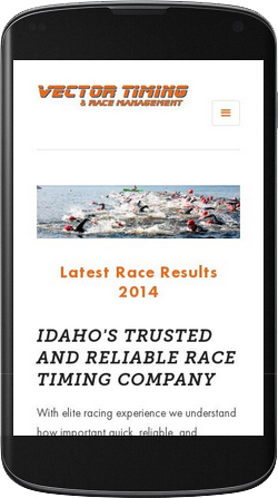
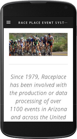
You probably spent a lot of time and money building up your brand in the race community – don’t let that go to waste because of bad mobile presentation. If you’re not providing a mobile-friendly experience for your customers, then they may be turned off and go to your competitors whose website are easier to use. The future is mobility, as we see more and more people favoring their smartphone over a computer. Below are a few examples of some ChronoTrack partners that have recently turned their websites into responsive, user-friendly sites:
As the mobile web continues to grow and gain popularity, the need for a mobile website will soon enough be as necessary as a regular website. Is your website mobile-friendly?
To learn more about ChronoTrack, contact us.
